Making A Website 04 - Responsiveness
| 4 min read
Our light website is coming along nicely! By now you should have a light website that looks good, has multiple pages and a menu. But there's still some work to do - today we're going to make our website responsive.
What is responsiveness?
Before we start making our website responsive, I think it's important to understand what responsiveness actually is. Put simply, responsiveness tells your website to respond in a certain way under particular conditions.
In this case, we're going to setup our website to respond to a small display, like a mobile phone, by reformatting the images and menu. This sounds really complicated, but it really isn't.
The CSS
The first thing we need to do is to add some additional CSS to our style.css file. Here is the CSS you will need to add:
/* Make the website responsive */
@media screen and (max-width: 100%) {
  .main {
    width: 800px;
  }
}
@media screen and (max-width: 640px) {
  ul.nav li {float: none;}
}
.main {
  float: center;
  width: 100%;
  max-width: 800px;
  margin: 0 auto;
}
There are basically three different statements we're making with this CSS. In the first @media statement we're setting the width of the .main section (more on that later) to 800px.
In the second @media statement we're telling our website to reformat the menu to a single item per line if the screen width is 640px or less.
The .main statement formats the body of each page to actually make it all respond how we want it to.
You will also need to ****make some changes to the body section of your style sheet:
/* BEFORE */
body {
  background: var(--bg);
  color: var(--main);
  font-family: sans-serif;
  font-size: 1.1em;
  display: block;
  text-align: left;
  width: 800px;
  margin: 0 auto;
}
/* AFTER */
body {
  background: var(--bg);
  color: var(--main);
  font-family: sans-serif;
  font-size: 1.1em;
}
The final CSS change you need to make is to add responsive formatting to images so they adapt too. This will stop them scrolling off the screen as it shrinks. Instead, they will adapt and shrink with the screen:
/* Format images */
img {
  max-width: 100%;
  height: auto;
}
img.home-banner {
  padding-top: 20px;
  padding-bottom: 20px;
  max-width: 100%;
  height: auto;
}
The HTML
That's it for the CSS. We now need to make some HTML changes. These steps will need to be done on every HTML page on your website.
The first step is to add a viewport to the <head> section of every webpage. The additional line is highlighted below on line 3:
<head>
<link href="style.css" rel="stylesheet" type="text/css" media="all">
<meta name="viewport" content="width=device-width, initial-scale=1.0">
<link rel="shortcut icon" href="images/favicon.png" />
<title>mylightwebsite.kevq.uk</title>
</head>
Viewports require a bit of explanation, but I think doing so would derail the flow of this post. If you want to learn more about viewports, take a look at this page.
The final step is to add support for the .main section. Again this needs to be done on all pages of the website. This is done by adding a <div> inside the <body> tag. See lines 2 and 19 below:
<body>
<div class="main">
<!-- *** NAVIGATION SECTION *** -->
<ul class="nav">
  <li class="nav"><a href="index.html" class="active">Home</a></li>
  <li class="nav"><a href="about.html">About</a></li>
  <li class="nav"><a href="contact.html">Contact</a></li>
</ul>
<!-- *** END NAVIGATION *** -->
<img class="home-banner" src="images/home-banner.png"></img>
<!-- *** START PAGE CONTENT *** -->
<p>Your page's content will go here!</p>
<!-- *** END PAGE CONTENT *** -->
</div>
</body>
That's it, your website is now responsive. No, that really is it! I told you it was simple. If you want to test it out, visit your website and shrink your window so it's not full screen. Then, keep reducing the width of the window, eventually you should see the menu flip to its responsive mode:
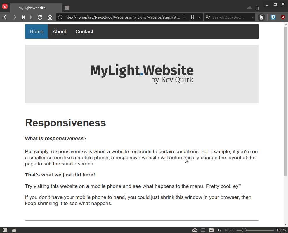
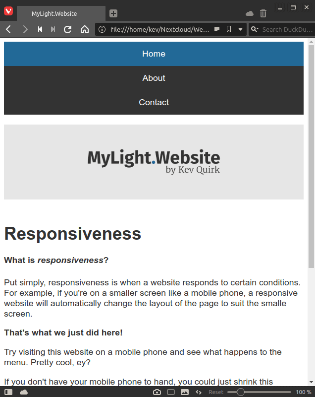
Look at that beautiful, responsive website! Great work, folks. As you can see, our banner image, which is 800px wide, has shrunk with the webpage so the formatting remains in place.
Conclusion
We're nearly at the end of this series now, there's just two posts left were we will be adding a blog and the finishing touches to our website.
As usual, I have added the source code for everything that's covered in this post to the downloads page of mylightwebsite.kevq.uk. You can also use this site to work through each step in this series in a wizard-like fashion.
Subscribe for more!
You don't have to keep coming back here to read my latest waffle. There's a couple of ways to subscribe to receive updates whenever I publish new content.