A Nod To The 90s Web
| 3 min read
My wife and I recently watched Halt and Catch Fire, which is a 4 season show following a group of technologists as they go headlong into the 90s web and the .com boom. It's a great series, I'd highly recommend it.
Anyway, watching that series (for the second time) made my little heart yearn for the good old days of the Internet during the late 1990s and early 2000s ?. They were glorious days that showcased all sorts of really cool and interesting personal sites that were full of whimsy.
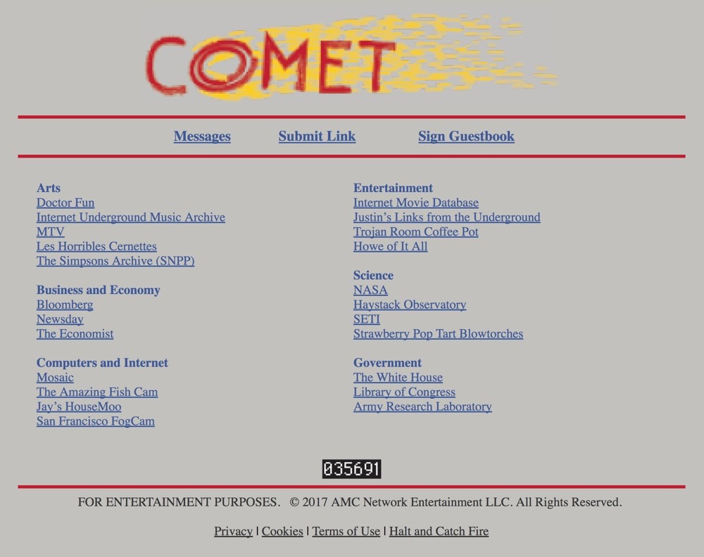
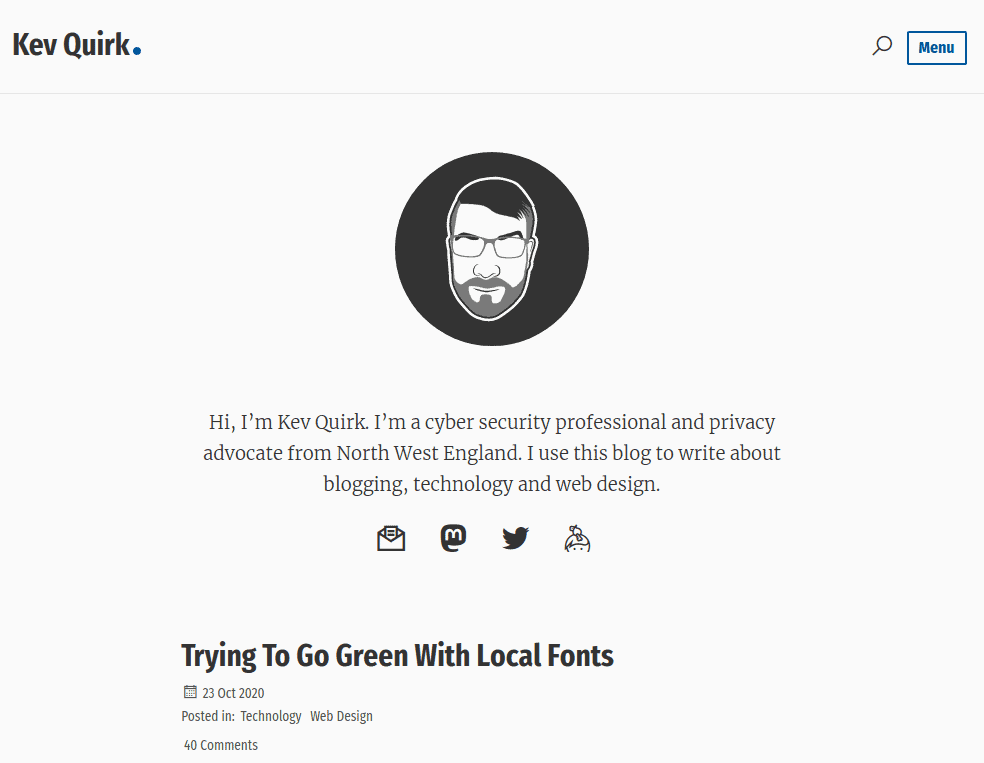
I decided that I wanted to get onboard with some of this nostalgia. My own site, this very one that you're on now, had a very clean and spars look to it. It had beautiful typography and was very content focussed, but it had no character. More importantly, it didn't portray my character. Which I think all good personal websites should.
The 90s web redesign
The redesign had to be a nod back to those Geocities days where webmasters did all kinds of cool things with their sites. But I didn't want it to be pages of pixelated GIFs (pronounced gif, by the way, not jif ?) and 8bit pixel art. No. It had to reflect my personality, be interesting to visitors, lightweight and easy to read.
I don't think I did too badly.
I've called this new theme Nineteen Quirky and it's available on GitHub right now for you to download and play with. Here's a list of some of the things I've done with Nineteen Quirky:
- A 90s web feel with a modern twist.
- Emoji all the things. ?
- Replaced site-wide comments with a guestbook.
- Some whimsical Easter eggs (you will need to find them yourself).
No more comments?
That's right, no more comments. I've battled with removing comments in the past, but decided to bring them back in the end. This was a mistake. They're a headache and are difficult to manage.
Plus, most 90s websites that I knew of didn't have a comments section. No, instead they had a guestbook. So in true 90s fashion, I've also implemented a guestbook on this site. Please feel free to pop on over there to sign it.
My personality
Although my previous theme was cool, it had no character. It was pretty much a blank slate with some words on it. It was...boring. Very nice, but boring nonetheless.
I wanted my 90s web styled site to include more of my personality. So from now on I'm going to try and write in a more informal way that includes some jokes etc.
Wrapping up
I really hope you like this new version of my website. I've worked hard on it and I'm really happy with the results. Oh crap, I almost forgot...I said earlier it needed to be light. Here's how light it is:
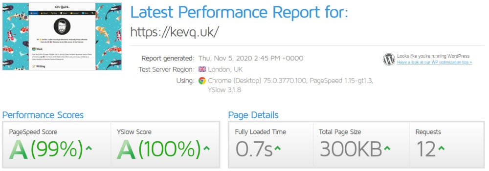
With a page size of 300kb that includes the new background images, and a load time of 0.7 seconds, I'm pretty happy with how light it is.
What do you think? Is the new design any good, or do you hate it? Get in touch to tell me your thoughts.
Subscribe for more!
You don't have to keep coming back here to read my latest waffle. There's a couple of way to subscribe to receive updates whenever I publish new content.