Making A Light Website 08 - Replacing Images With CSS
| 6 min read
When I first took you through the process of making a light website, I added a banner to all pages that was a basic image. That image looked like this:
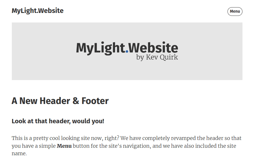
Images are great, and add an interesting dynamic to a webpage, but they add weight and can slow down the loading of a webpage. Plus, it means you have to edit every image if you want to change the look of your site.
So I decided it would be better to change the image with a nice formatted block of HTML & CSS. This will offer us much more flexibility if we want to change something at a later date. It also means that no additional images are loaded, making the site lighter and therefore quicker.
Here's what the site looks like with the CSS banner implemented:
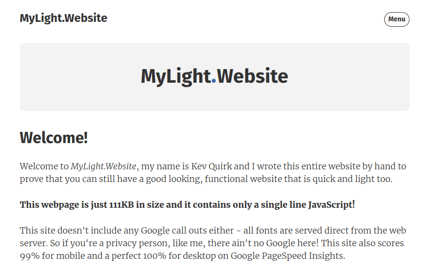
Right, with all that pre-waffle out of the way, let's get on with implementing the banner in CSS shall we?
Replacing the banner image
If you take a look at the source code of the website in step 7, you will see that the banner image is added to every page with the following line of code:
<img class="home-banner" src="images/home-banner.png" />This line of code is inside the .main div. On the index.html page, it is line 26. Delete this line of code.
Once you have deleted the code for the banner image, add the code snippet below above the opening .main div.
<div class="banner">
    <h1 class="banner-text">MyLight<span class="logo_dot"></span>Website</h1>
</div>

/* Start of the .main div */
<div class="main">
If we were to take a look at the webpage now, it should look something like this:
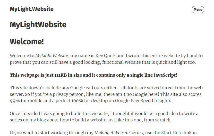
That new banner doesn't really look like much of a banner at the moment, does it? That's where our CSS comes in so we can format things correctly.
Breaking down the HTML
Let's start by breaking down what we've added with this snippet of HTML. First we add a new div with a class of banner:
<div class="banner">

</div>
Inside this new div, we've added a line of header text using the h1 tag. Again, we've given this header a class, which is banner-text, so we can apply formatting to this element only.
If we were to leave the banner-text class off and apply CSS to h1 only, it would apply it to every h1 tag on the entire site. So, adding a class means we only affect the banner text with the CSS we add later.
<div class="banner">
    <h1 class="banner-text">MyLight<span class="logo_dot"></span>Website</h1>
</div>
Notice the <span> element in the middle of the header? We've applied a class to this element too, and we will use some CSS to create the blue dot in the middle of the banner text.
Adding CSS
Now you have an understanding of what the HTML is doing on this part of the light website, let's start adding the CSS to format things. First we will format the .banner div with the following CSS:
.banner {
    background: var(--lighter);
    color: var(--main);
    text-align: center;
    margin-top: 2em;
    margin-bottom: 2em;
    border-radius: 8px;
}
We also need to add .banner to the responsive section of the CSS stylesheet, this is lines 13 and 22:
/* Make the website responsive */
@media screen and (max-width: 100%) {
    .main, .header, .banner, .footer {
        width: 800px;
    }
}

.main, .header, .banner, .footer {
    width: 100%;
    max-width: 800px;
    margin: 0 auto;
}
This ensures that the .banner div will follow the same rules as the other sections of the site, like the header, main body and footer.
If you don't do this, the .banner div will not align with the rest of the site and will not respond correctly on mobile devices.
If we take a look at the light website now, it should look something like this:
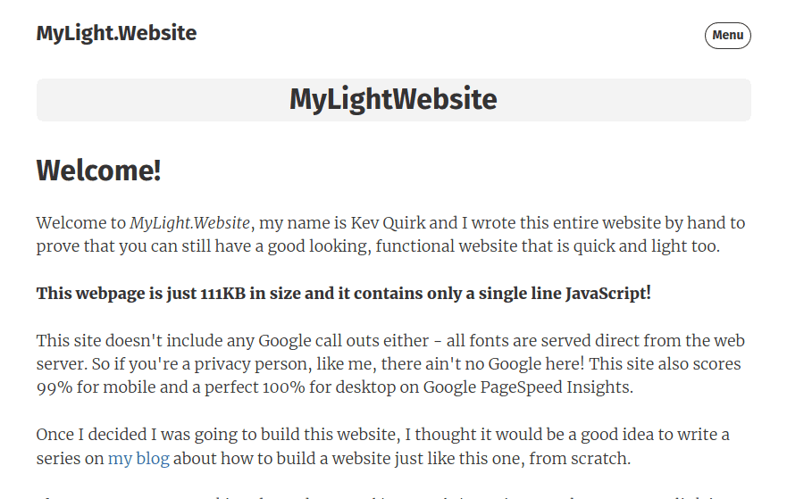
That's progress, but there's no blue dot and the banner isn't very tall. Let's fix that, shall we?
Banner text
Next we will change the formatting of the .banner-text class. We will add some padding so that the banner's background appears a little larger. We will also increase the text size slightly:
.banner-text {
    padding: 1em .5em;
    font-size: 2.5em;
}
If we take a look at the site now, we're starting to have something that resembles a banner. However, there's still no blue dot. Let's fix that next...
Adding the blue dot
For this, we're going to create a small circle purely in CSS and we will give that circle a blue background. Finally, we will add a small 2px margin so there's some white space between the dot and the letters.
span.logo_dot {
    background-color: var(--accent);
    display: inline-block;
    width: 8px;
    height: 8px;
    border-radius: 50%;
    margin: 0 2px;
}
If you want to change the size of the dot, simply change 8px on the width and height elements to decrease or increase the size.
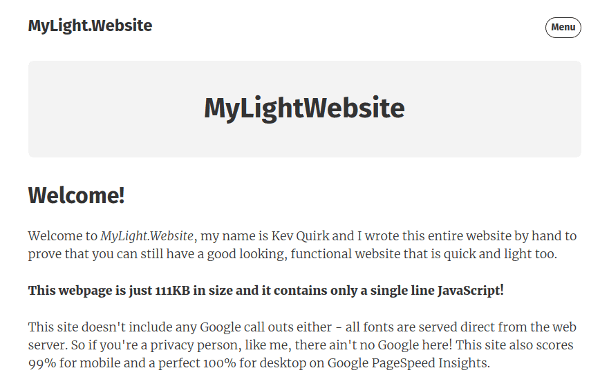
Back to the website and...ta da! We finally have a light website that has a banner written purely in HTML/CSS:
What next?
That's the banner on the homepage done. Now you can replace the image on the other pages with a similar piece of HTML that displays that page's title.
For example, this is what the Getting Started banner looks like:
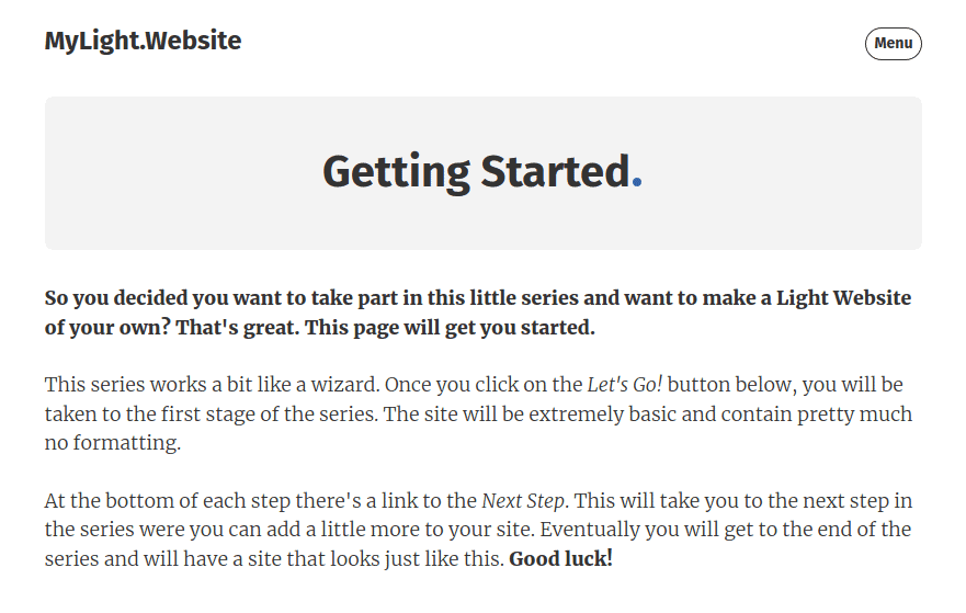
Here we are using the page title within the banner, and we have our familiar blue dot. The HTML for the banner on this page looks like this:
<div class="banner">
    <h1 class="banner-text">Getting Started<span class="logo_dot"></span></h1>
</div>
Tidying up
Once you have replaced all of the banner images with the CSS banner, don't forget to delete the actual image from your /images folder. Otherwise you're just wasting space on your web server.
Finally, you need to delete the CSS that formatted the old banner image. To do this, delete the following lines of CSS from your stylesheet:
img.home-banner {
    padding-bottom: 20px;
    max-width: 100%;
    height: auto;
}
If you want to inspect the entire source code for this project, you can view it on my GitHub profile.
View My Light Website on GitHub class: button
Conclusion
Designing and maintaining a website is a constant thing. It's not something you just set and forget (well, it's not for me at least). It's important to keep trying to improve your site's code and functionality.
With this update we have managed to make and already light website that little bit lighter. We've also been able to make maintaining it a little bit easier, as we don't need to manage images for our banner.
I hope you found this post useful. If you think there are more improvements/additions I can make to the mylightwebsite.kevq.uk project, please do let me know.
Subscribe for more!
You don't have to keep coming back here to read my latest waffle. There's a couple of ways to subscribe to receive updates whenever I publish new content.