New Layout
I've never been totally happy with the menu being at the top, so I wanted to use the extra horizontal space that laptop/desktop screens offer these days by implementing a sidebar layout.
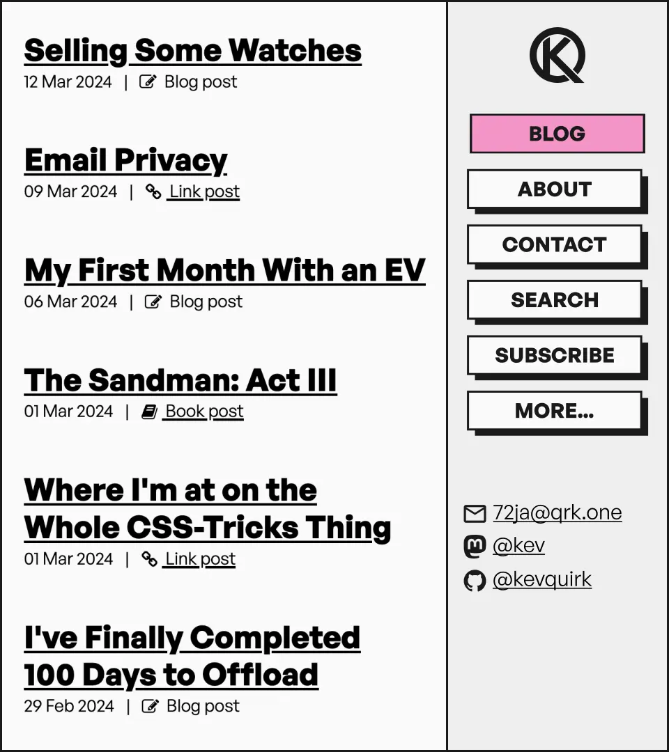
I threw together a quick mock-up, which looked like this:

My first attempt at implementing a sidebar was pretty much exactly the same as the mock-up above. It was sticky, so stayed on-screen at all times, but the result of this was that the content felt cramped as I scrolled down a page's content.
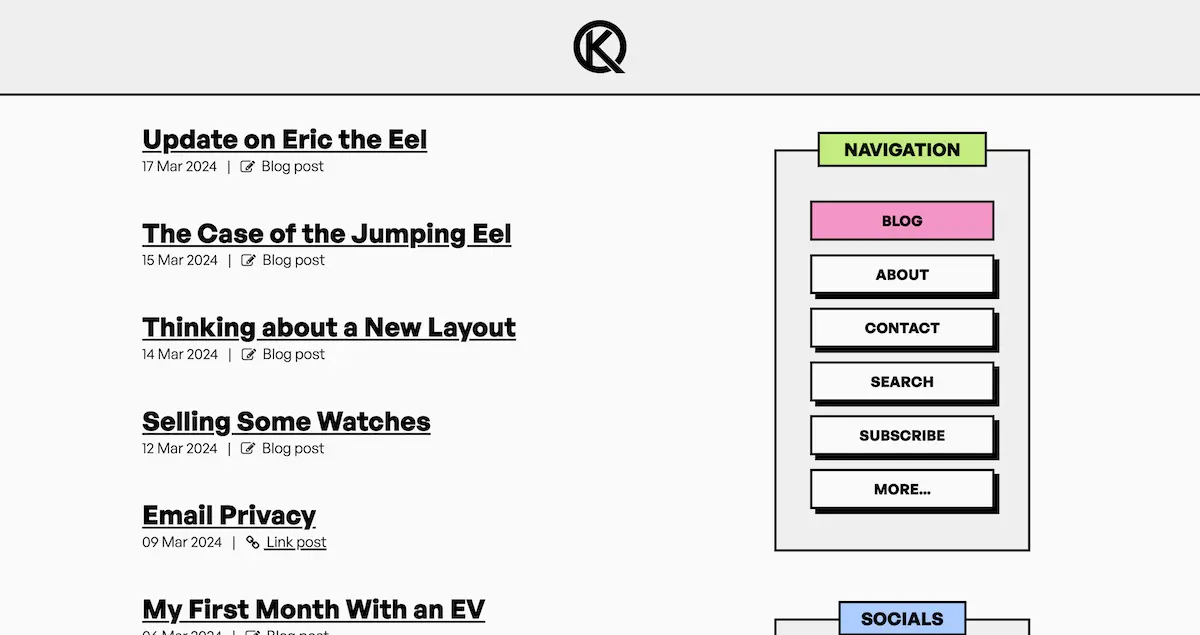
So I went back to the drawing board, and decide to emulate my notice boxes on the sidebar to make it a little more interesting and a little less imposing.
Here's what it looks like:

I really liked this, but transitioning to mobile and smaller screens was wonky. The sidebar would end up taking up around half the screen on smaller screens, before it wrapped below the main content. Then I had buttons to jump around the screen between the wrapped nav menu, and the top of the page.
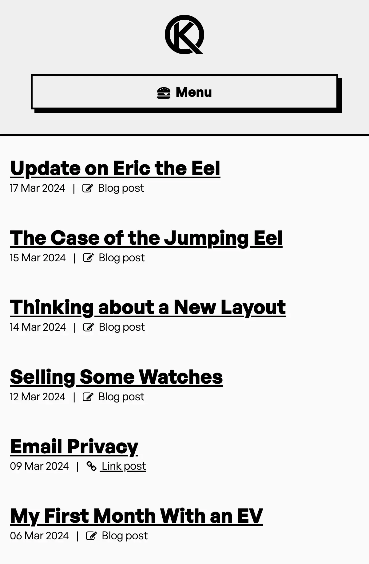
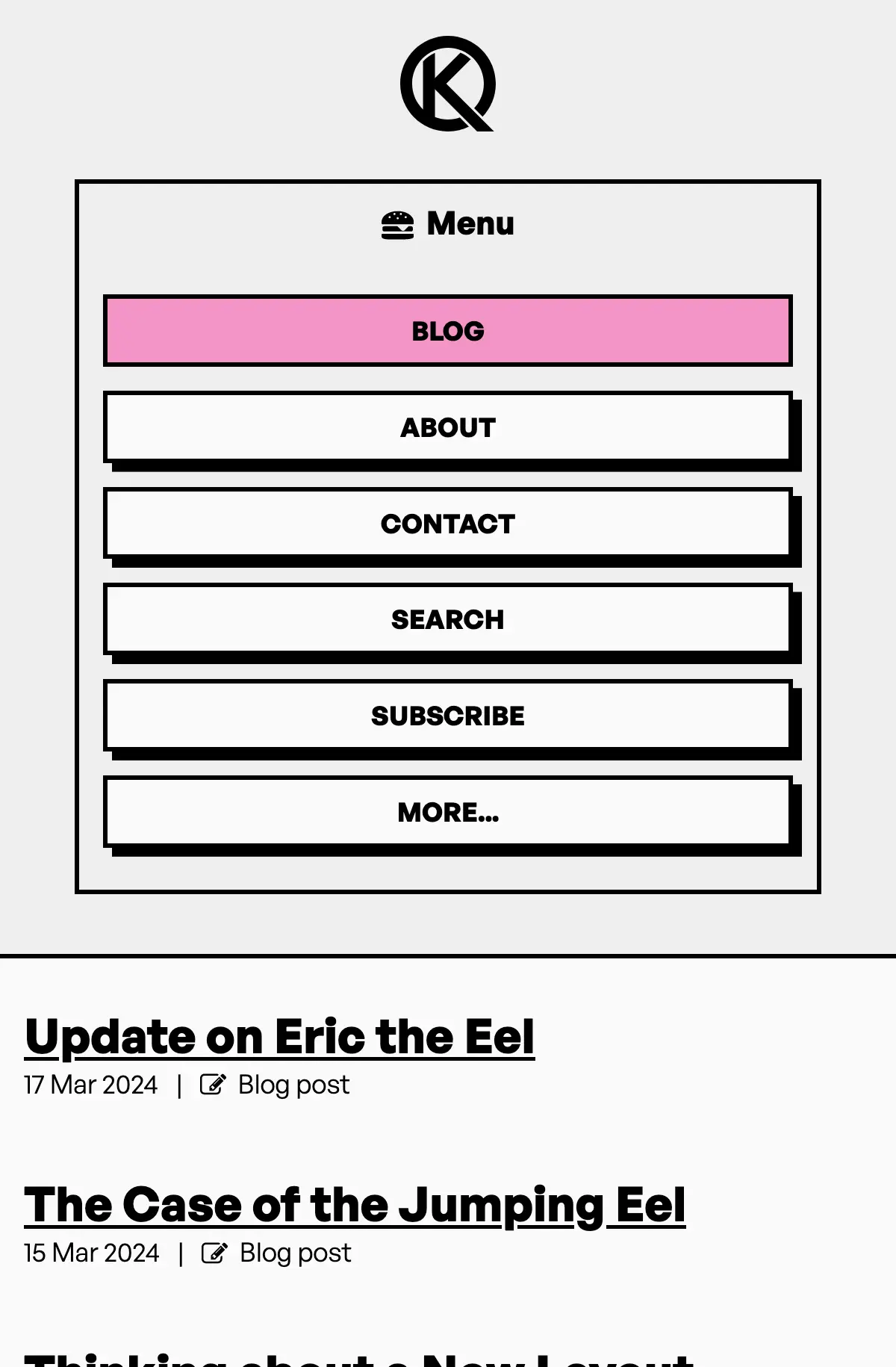
It worked, but it was a little awkward, so I decided to change things up and do away with the sidebar on smaller screens in favour of a more traditional hamburger menu:


I think the new sidebar layout works well, but there may well be bugs with the site as a result of making such large changes. If you do notice any weirdness, please let me know by using the reply link below.
Finally, I'd just like to thank Robb Knight for previewing my new layout and providing some feedback on the new look.
Subscribe for more!
You don't have to keep coming back here to read my latest waffle. There's a couple of way to subscribe to receive updates whenever I publish new content.