Adding Some Whimsy & Character
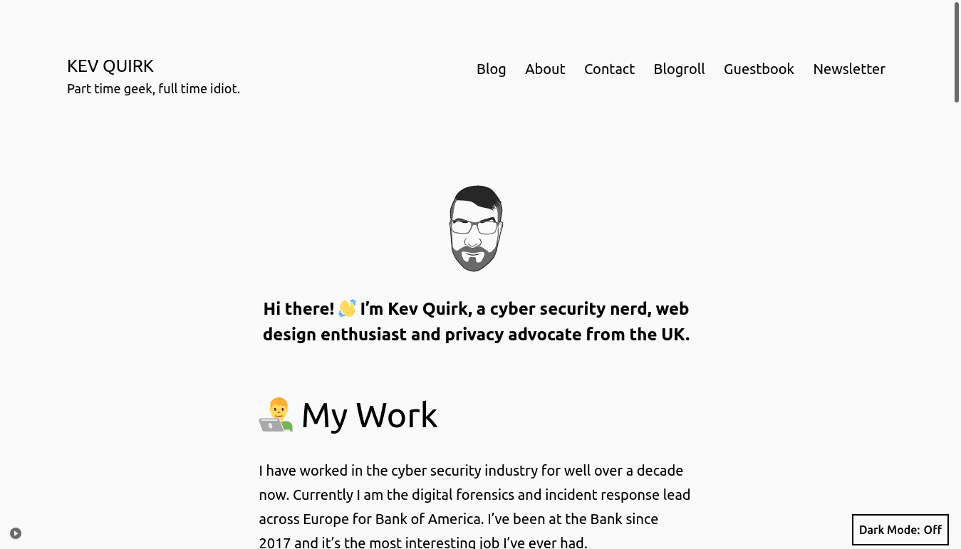
I recently posted about using the default WordPress theme, Twenty Twenty-One on this site. While the default look of WordPress works really well, it's too...boring. Here's how it looked:

I've posted a number of times about how I want to stop pissing about with my site's code and just write content. But I've been thinking a lot about that lately, and something dawned on me...
I like pissing about with my site's code!
It's the precursor for a lot of the content on this site. Plus, I really enjoy learning new stuff about web design and all the cool things you can do with it.
My playground
I've decided that I should stop trying to fool myself. This site is my playground. It doesn't need to look like a Medium blog - I can do what I like with it. If I want to make it bright pink and yellow, why the hell not, dear reader?
So around a week ago I started building a new theme and what you're looking at now is the result. It's far from finished, and things will change. But it's allowing me to have fun and express myself a little.
I may decide that “melting borders” aren't for me in a few weeks, or that I want to change the colour scheme from dark grey and blue (or orange if you're in dark mode) to something completely mental.
Update from the future: yep, it's 1 day later and I've got rid of the “melting borders” I didn't really like them - they felt tacky.
WordPress may fall by the wayside and I may flip back to a static site generator, like Jekyll. Or something else entirely.
Fact is, I feel like the flood gates have opened on my creativity and it's liberating. I don't know why I've held back for so long - it's fun! If I go too far and completely mess up the reading experience, there's always reader mode in your browser. 😀
What's changed?
Well, lots. There's a new theme, but with the same colour scheme. I've re-introduced some web fonts to make things a little more interesting.
I've also added some SVG paths between the header and footer to make things more...”interesting”.
You may hate the new design, and that's fine. Because I really like it, and it's my site, so that's all that matters right?
What do you think of the new design? Feel free to let me know by using the reply button below.