Design history of this site
This website started life back in 2013, and one of my favourite things to do with it is change its design. This page documents the design history of this site for nostalgic purposes.
June 2013 - vintage design
The first version of this website was based on WordPress and had a vintage art deco look to it. Here’s what it looked like in June 2013:
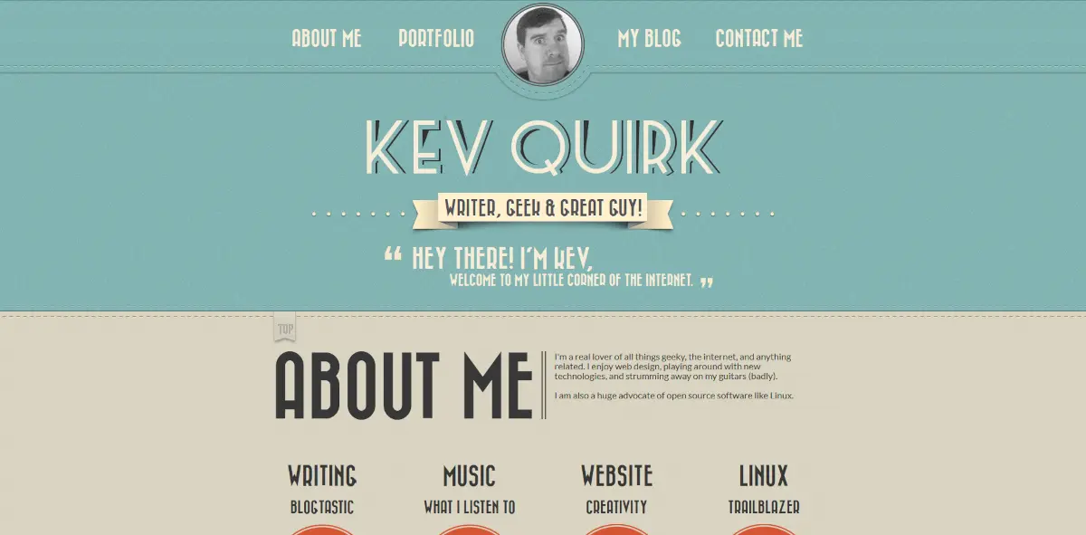
Lots of colours, lots of noise, lots of bloat. But it does have a certain charm to it. Even today, many years later, I think the design holds up reasonably well. If you want to poke about, here it is on the Internet Archive.
I still quite like the design, but there’s way too much info fighting for the reader’s attention. Plus, the typography isn’t great.
December 2014 - vintage 2.0
The WordPress theme above was an off-the-shelf job from somewhere like Theme Forest? Over the next year and a half I continued to learn about web design and managed to create my own version of the theme that was (I think) a little tidier.
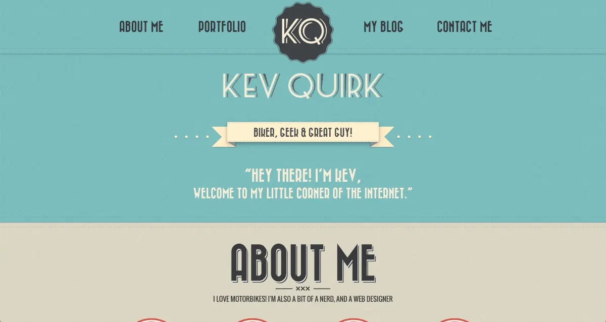
It’s very similar to the previous design, I’ve just spruced it up a little. The colours are more vivid, but looking back, I think I prefer the colours on version 1. While still too much, there does seem to be less going on though.
I have no idea why I felt it was prudent to have both “KQ” and my full name above the fold. But we live and learn.
My typography choices had improved slightly, instead going for a marginally larger slab font for body copy. It still wasn’t great though.
If you want to peruse this version of my site’s design history, here’s a link.
November 2015 – the minimalist era
We’re now up to 2015. Moving away from the vintage look, I flip things on their head and go quite minimal.
I changed up the homepage design to be a horrendous cartoonified image of myself (where I look REALLY fat) surrounded by buttons to various pages.
The buttons don’t have any labels until you hover either, so the accessibility is non-existent. 🤦♂️
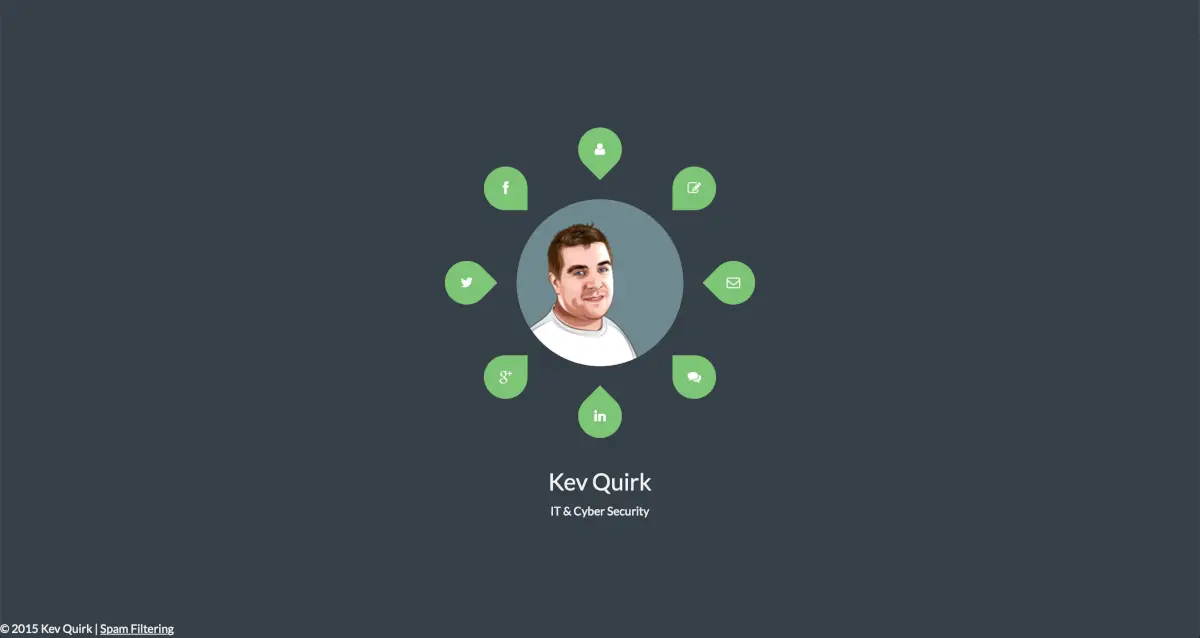
Look at that avatar! It’s horrendous! The social links are ok, but it’s really difficult to work out what the other icons link to. For example, the chat bubbles go to my blog. Go figure. 🤷🏻♂️
Did you notice the Spam Filtering link in the footer? That’s because I was self-hosting my emails at the time and I used a 3rd party spam filtering tool that allowed for additional licenses if you linked back to their site.
I’m happy to say that the blog for this version of the site wasn’t quite as bad as its accompanying homepage. Here’s what it looked like:
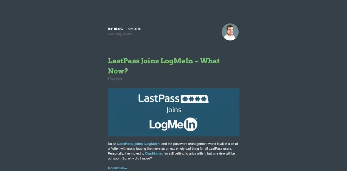
Well, I say it was better...the colour palette was almost unreadable and it’s nigh on impossible to read the menu links. I really was winning at accessibility, right?
If you want to give your eyes a feast, here’s the Internet Archive link.
November 2016 – trying to be professional
This time around, I’m trying to market myself more professionally – I even have a suit on in my avatar! I have no idea why, as I don’t make my living on the Internet, but there you go. 🤷♂️
Animations were in vogue at this time, so I went mental with them. Pretty much everything on this version of the site is animated.
I also changed the domain from kevquirk.com to kevq.uk which it remains on today. The old domain still redirects here though.
I’ve considered moving back to I've since moved back to kevquirk.com a few times, but never wanted to commit to the headache of changing domains. I may do one day though.kevquirk.com.
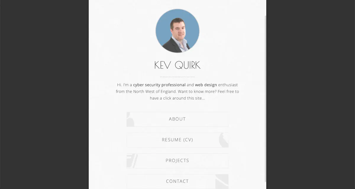
At least the text is kinda readable now; although still not great. If you want to take a look at this version of the site, in all its animated glory, here you go.
June 2017 - Orange 1.0
After 2016 I decided to nuke my blog and and went without for a year or so. When I came back to it in mid-2017, I decided to go with Ghost initially and for some strange reason, I decided on an obnoxious orange accent colour.
I still have no idea why I went with orange, but I did. Here’s the original Ghost blog:
I had learned a lot about web design over the preceding years. Because of this, we’re starting to see better typography, more focus on content and more white space.
I have no idea, however, why I decided to with the very angry looking avatar for this portion of my website’s history. Either way, you can take a look at this design here.
July 2018 - Orange 2.0
In July 2018 I decided to ditch Ghost and return to WordPress. I also got rid of the angry Kev avatar and flipped it to a minimal one I'd created.
I also decided to double-down on the awful orange colour. I have no idea why, I’m clearly an idiot.
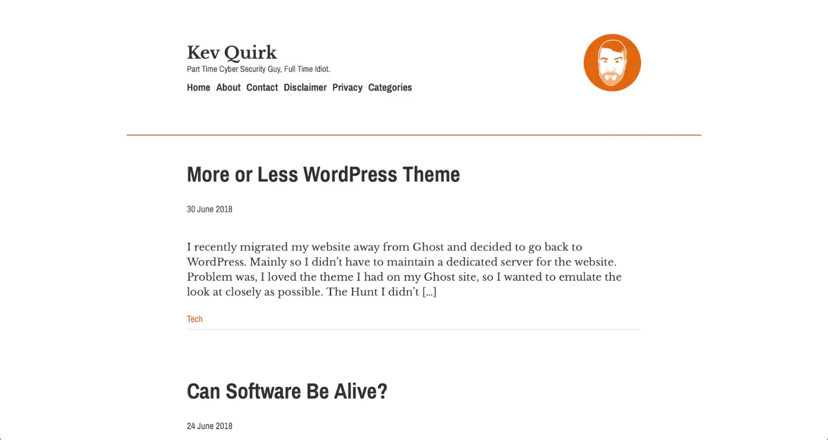
I was using a custom theme that I had built on top of Less that I dubbed, More or Less. I really liked this design; the typography was nice, and the site had very little bloat. Take a look yourself.
July 2019 - Orange 3.0
Yes, that’s right. I kept the sickly orange for a third iteration of my website. I decided I didn’t want to maintain my own theme any more, so bought a nice off the shelf theme from Theme Forest.
The theme is called Alia and is still available today. It’s a great looking theme, but it does include more bloat that I’d like. And yep, I ruined it with the sickly orange colour.
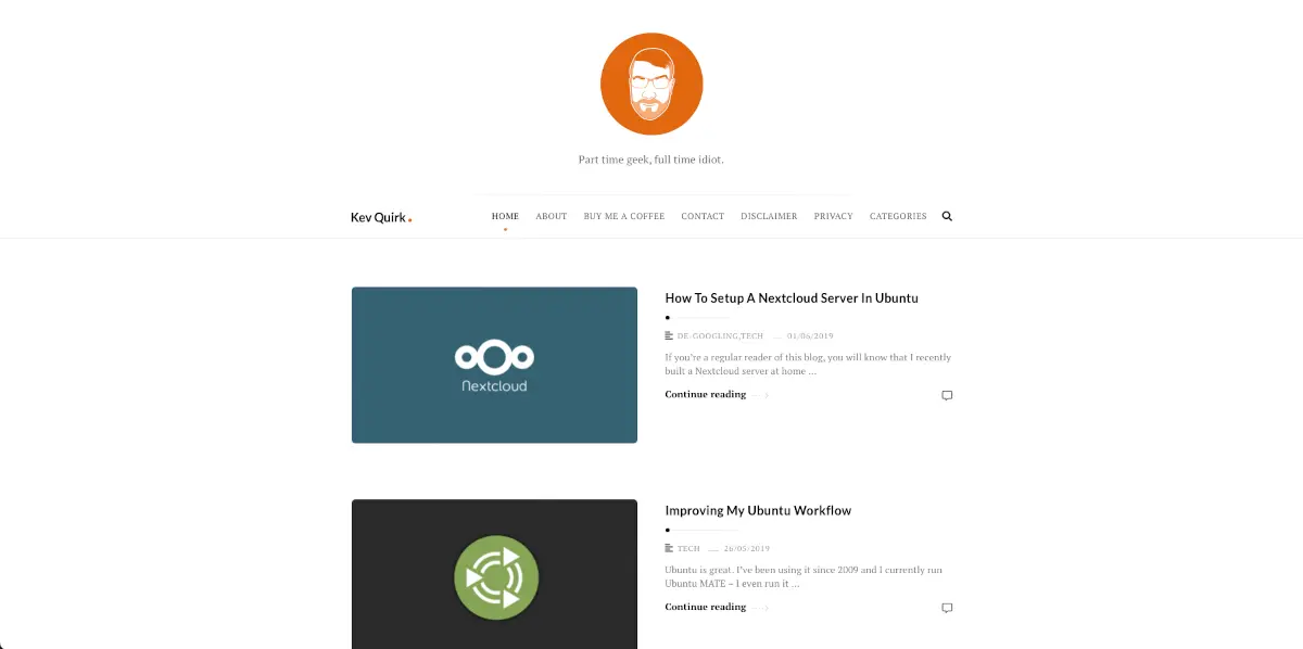
Even more white space now. Nice typography and imagery, but in hindsight, I think the text should have had more contrast. If you want to have a look at this design, here you go.
Website puberty
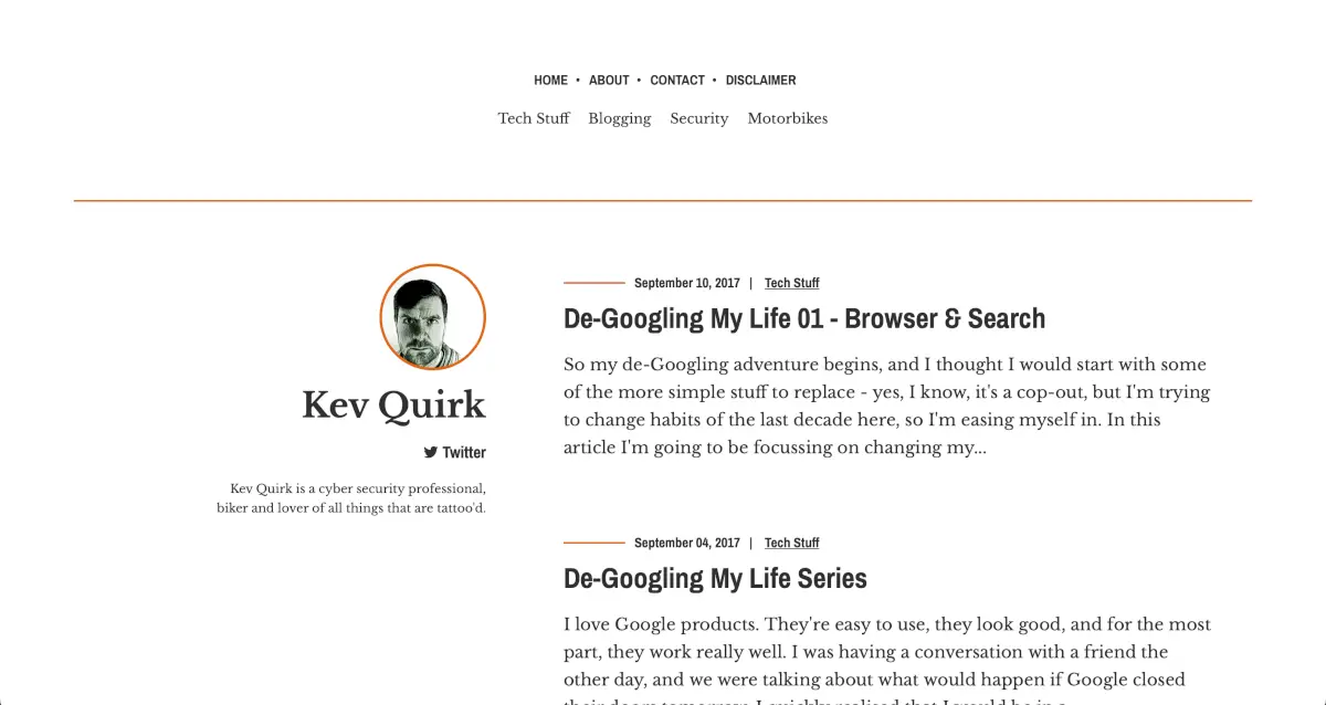
At this point, I started really playing around with the design of this website and trying new things. I flipped many times between different platforms, including Grav, back to WordPress, to Jekyll and finally back to WordPress again.
I didn’t really know what the identity of the website was, or what the right platform was to support it. You could say that this website had come of age and was going through its puberty.
April 2020 – design, re-design, and more design
2020 was when I really experimented a lot with this site. It’s also the most turbulent stage of the website’s history in terms of its design. The design changed completely 3 times over the course of 2020.
Firstly, in April 2020 I had finished playing around with Ghost and Grav, then came back to WordPress. I went with a really minimal theme with nice typography.
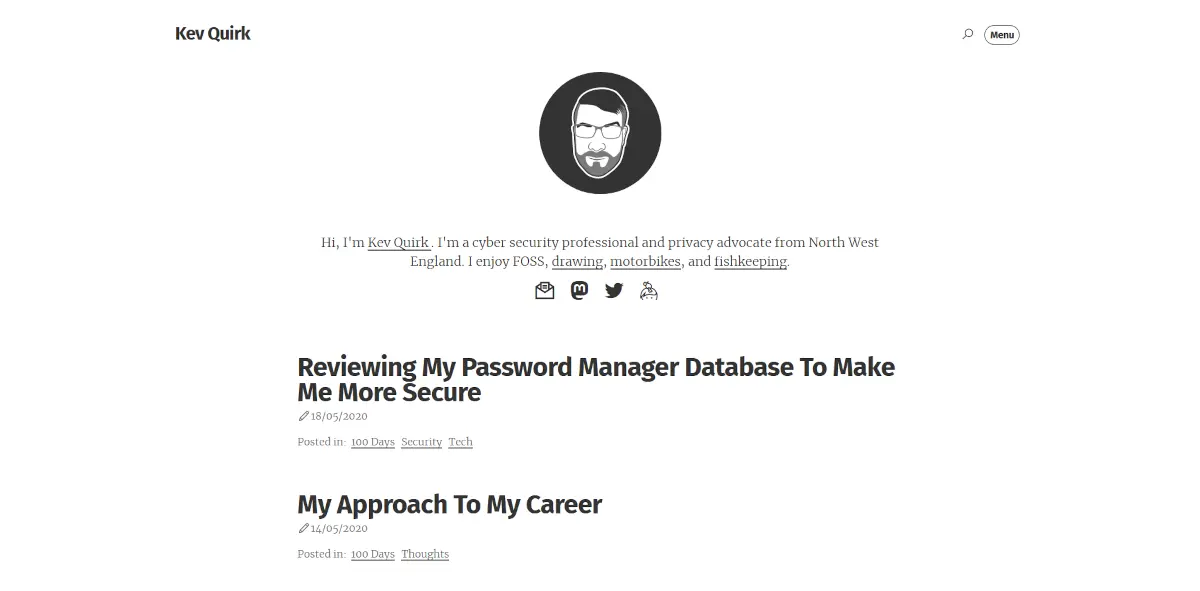
If you're interested, the fonts I used were Fira sans condensed for the headers and Merriweather for body.
You’ll be glad to see that the sickly orange colour is no more. This was a very simple design, with just one colour – grey.
One of the interesting things about this design was that in order to cut down on JavaScript, I chose to have a separate page for the menu instead of a JS pop-up.
The site was so quick that the menu page load wasn’t noticeable, so felt like a native full-screen menu. That probably won’t be the case on the Internet Archive, but it did work well on the live site.
November 2020
Seven months later, I was generally happy with the design of my site, but I wanted something a little more fun and old school. A harp back to the good old Web 2.0 days.
So I built a new WordPress theme that didn’t take itself too seriously and included way too much of my face on it:
At this point I really started to hit the minimalist train. Not minimalist in design though; it was more about cutting out any bloat. I think this is around the time I started the 512KB Club too.
So I had a local font stack and used emojis instead of SVG icons. There was still no JavaScript either. This resulted in the entire homepage being less than 50KB.
But I was never happy with it. I just never sat right with me. It was a bit whacky and out there, but it really didn’t float my boat. What do you think of it?
December 2020
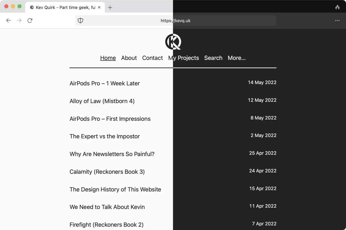
After running the whacky theme for just a month, I decided to double-down on my lack of bloat and ditched WordPress in favour of Jekyll (again).
I went super lightweight on this design. Again, no JS, minimal CSS, all highly optimised. This site was around 30KB in size.
I have to say, I loved the design of this site. I actually still love the design of this site. It was just so simple and clean.
Instead of using a hamburger menu, I went with a sausage menu for this particular instalment of my website’s history. I thought it worked really well, but I received feedback from a number of people that it wasn’t user friendly despite having an animated “more stuff this way” notice.
Take a look yourself on the Internet Archive and tell me what you think. I really did like this version of the website and I do miss it.
February 2021 - Back to WordPress
Creating content in Jekyll is a pain, and with the feedback on the sausage menu, I decided to flip back to WordPress and come up with yet another theme.
I kept it similarly simple, but the design of the menu was more traditional in that it was a full width bar at the top of the page, which responded to different page sizes. All very boring.
It was a nice theme, but it was too boring. I’d had some kind of grey and white design for the last couple of years and once again, the theme just didn’t float my boat. Here’s the site on Internet Archive if you want to take a look yourself.
April 2021 - I'm blue da ba dee
I decided to re-design the site to have all the blue. I think it looked great and was very happy with the design for a couple years.
This version of the site was still running on WordPress and used the GeneratePress theme. If you're a WordPress user, I'd strongly recommend GeneratePress as it's very powerful, yet lightweight.
This version of the site scored perfectly on Google's PageSpeed insights, which is impressive for WordPress.
May 2022 - brutally simple
At this point I decided to move away from the blue theme and went with a more brutal design. You can read my post about it here.
I was back to grey and white, and I enjoyed it. Unfortunately the Internet Archive didn't capture this version of the site, so you only have the screenshot below.
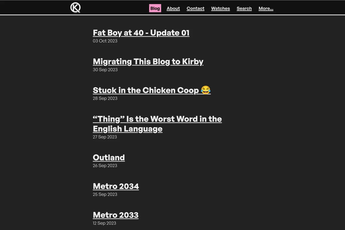
September 2023 - brutal Kirby
I didn't like the way WordPress was headed with blocks everywhere, so in September 2023 I flipped to Kirby. At the same time, I decided to give the brutal design a bit of an overhaul. It wasn't a huge change, just some design tweaks here and there. This is the first time I started to introduce colour too, with my pink accent colour.
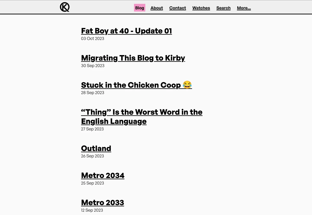
Here's this version of the site on the Internet Archive if you want to check it out.
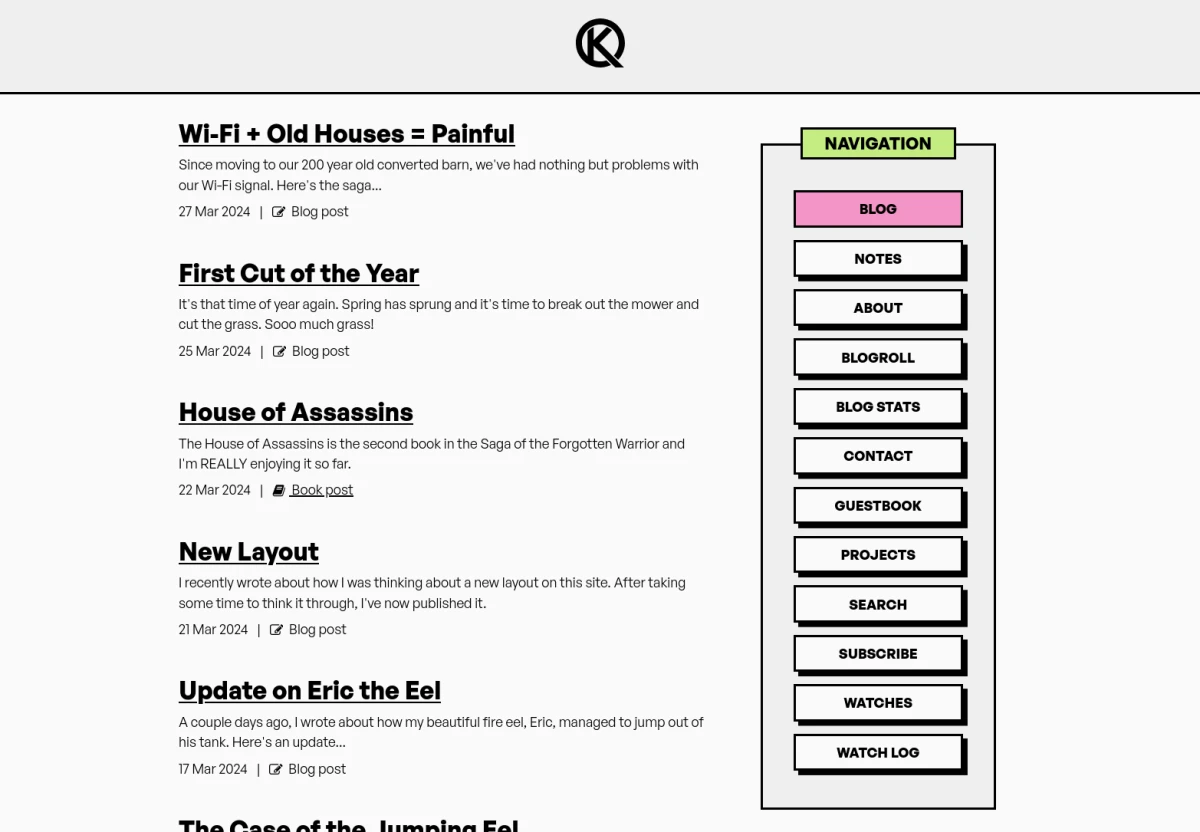
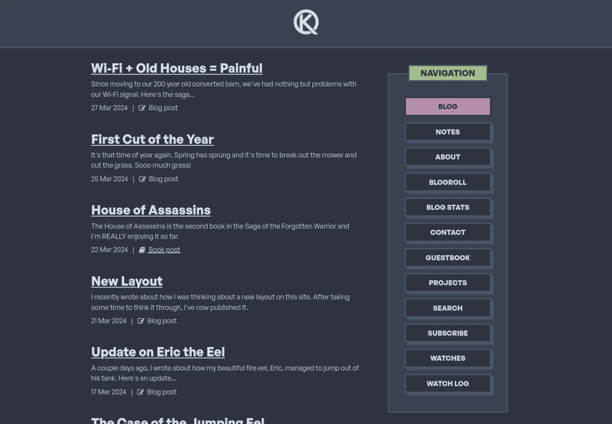
March 2024 - brutal updates
The brutal design stuck for quite some time, and I continue to use it now. Although in March 2024 I evolved the design to be more colourful and use a sidebar instead of a traditional nav menu in the header. I also improved the dark-mode colour scheme and based it on Nord.
The site is still brutal in its design, but it has some whimsy to it too. Here's a link from the Internet Archive so you can experience it yourself.
And that brings us to the current version of the site, folks. I'm still running Kirby and still very happy with it, although I had a wobble recently, I've decided to stick with it.
As I inevitably re-design this site, I'll keep this page updated. I've been thinking about a re-design lately and updating this page really has me thinking about that December 2020 version of the site - I really liked it, so maybe there's a re-design in the near future that incorporates some of those design cues.
We shall see...
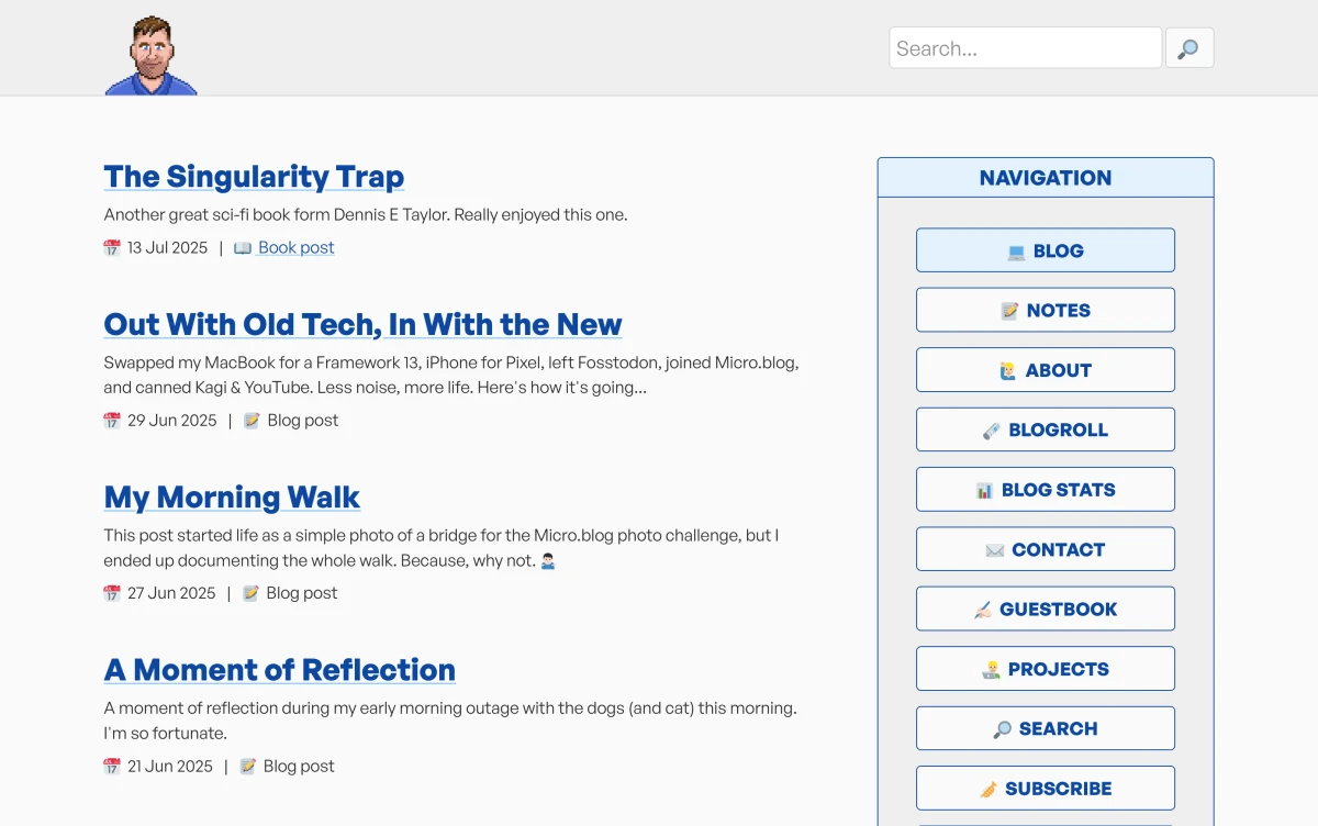
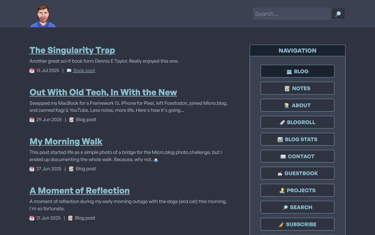
July 2025 - blue brutal
After updating this very page, I got nostalgic for the 2020 version of this site (the one with the sausage menu) and so I went down the re-design rabbit hole. First I started building something that was very similar to the 2020 version, but after playing around and thinking about it, I worked out that what I really liked from that version of the site wasn't necessarily the design. It was the colour pallet.
So as of July 2025, I've released a new version of this site that's pretty much exactly the same as the previous one, albeit with a similar colour pallet as the 2020 site.
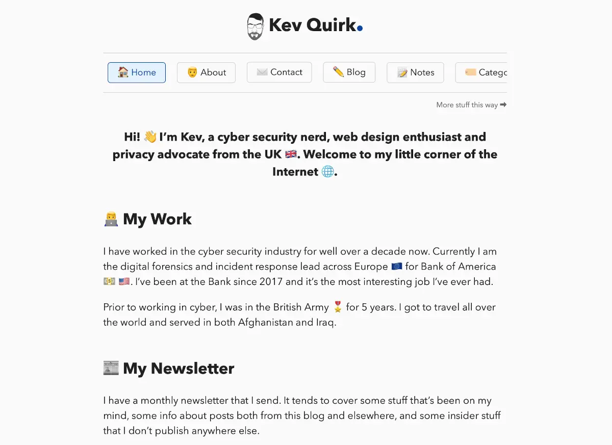
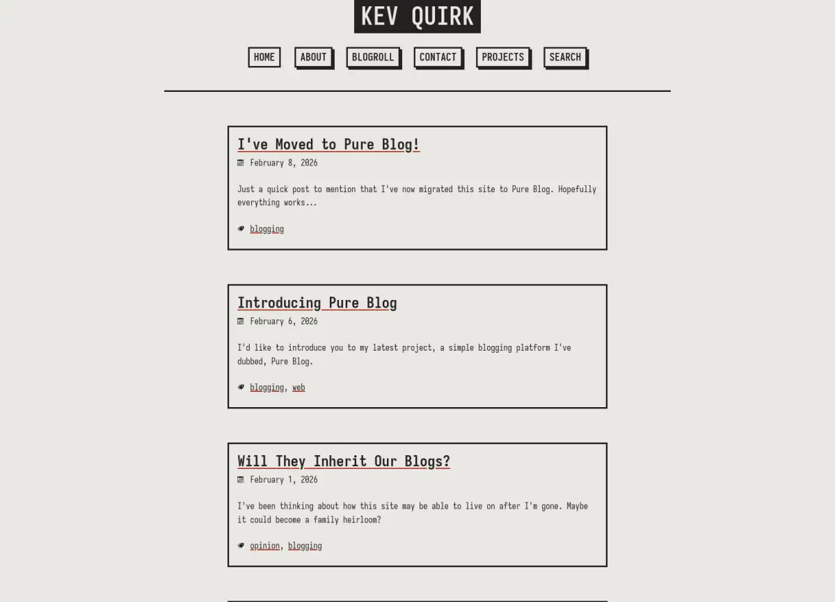
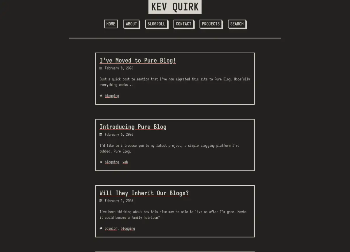
February 2026 - Pure Blog
After working on Pure Blog for months I finally released it and flipped this site over to Pure Blog too. At the same time, I decided to switch up the design of the site once again.
I went with a light beige colour scheme, and a look that resembles the design from March 2024, albeit with a monospace font this time.
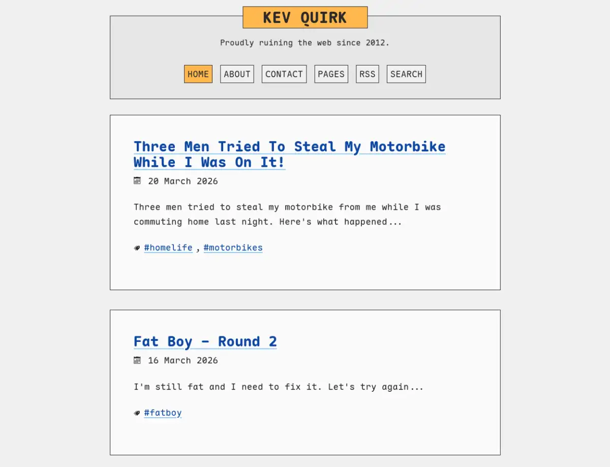
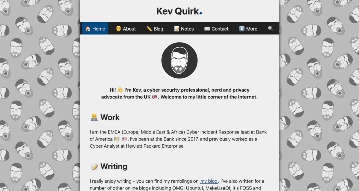
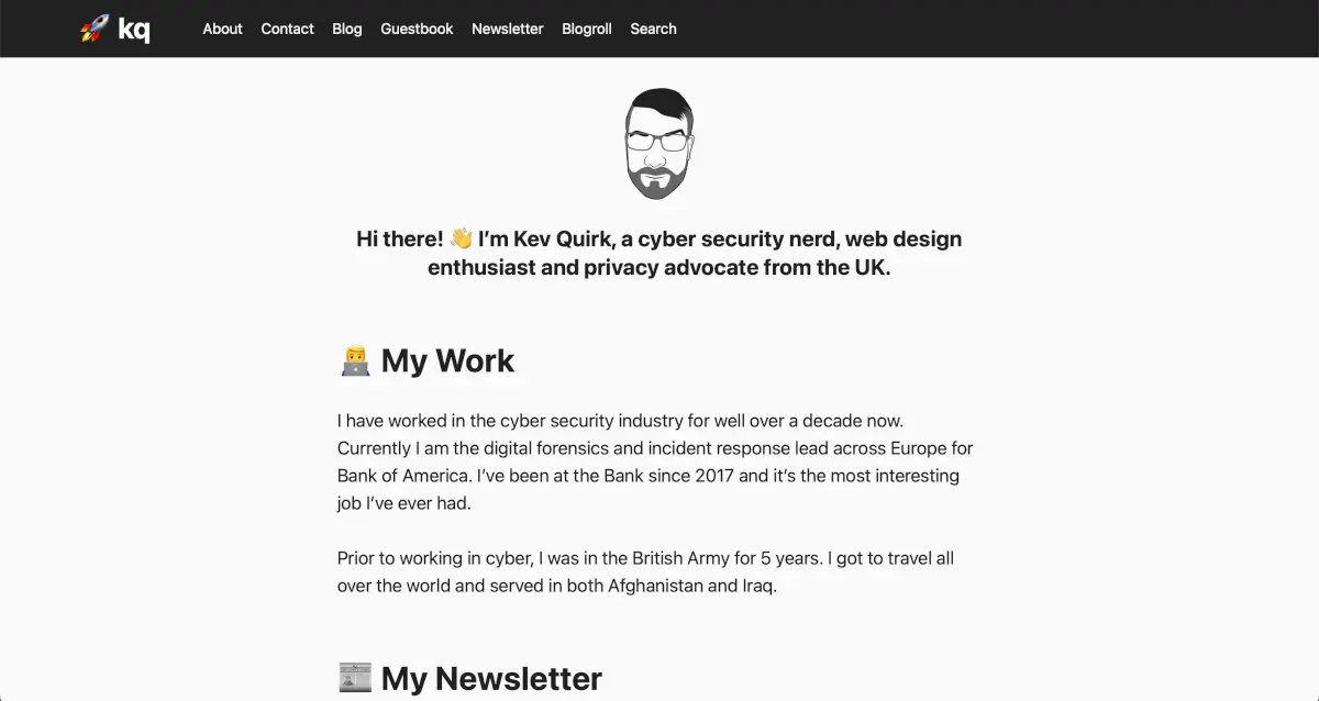
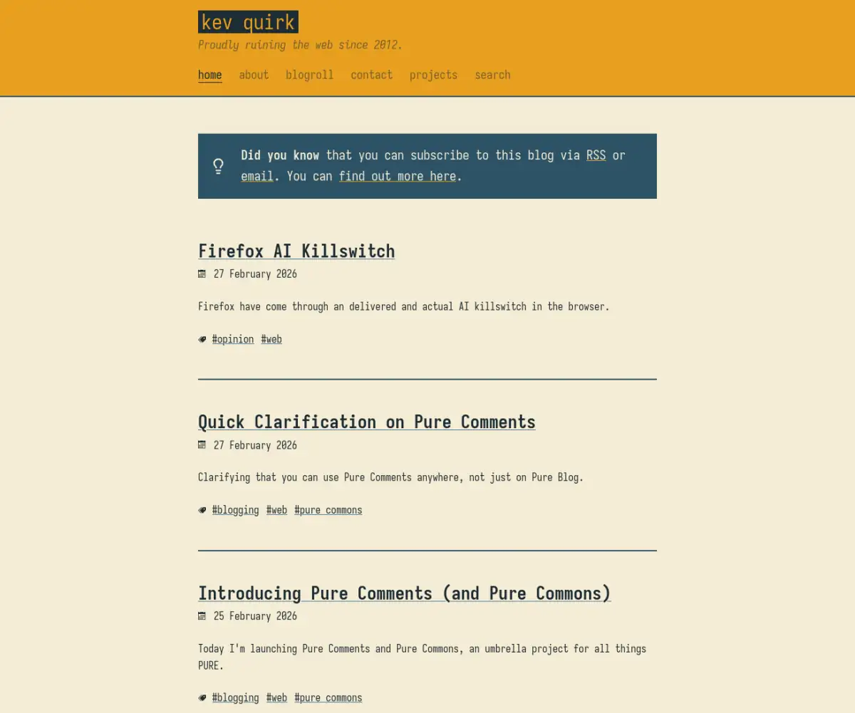
March 2026 - Mustard Man
The re-design I did when I switched to Pure Blog didn't really jive with me, so I changed things up again. As of March 2026, I have a lovely mustard and steel blue design that I think looks fantastic.
All thanks to some inspiration from a tea pot and water can!
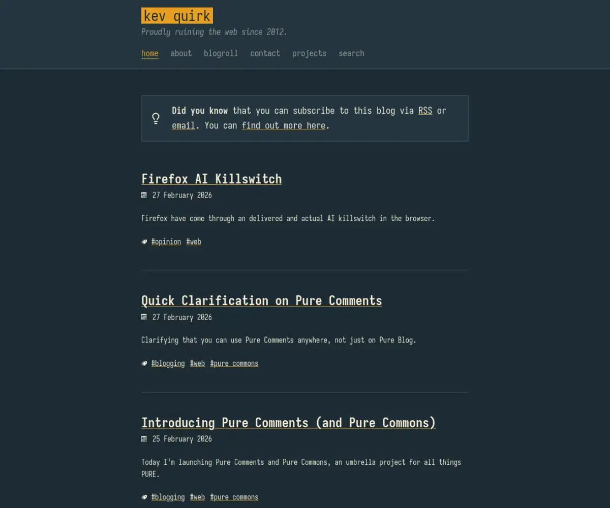
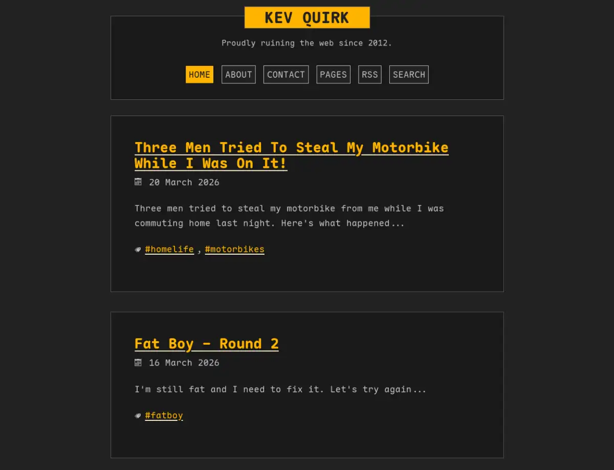
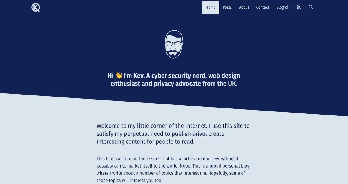
March 2026 - Round 2
Although I liked the mustard and steel blue colours, they just didn't work on the website. If I look through the various designs here, the ones that have stuck around the longest have always been mostly greys with a splash of colour.
So I updated the site again (as Pure Blog makes this really simple) with a design that's more to my liking.