Another New Lick of Paint
| 2 min read
Around a month ago I switched this blog to Pure Blog, at the same time, I decided to simplify the design and give it a new lick of paint. Here's what it looked like:
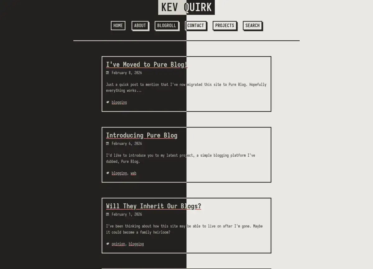
It was okay. But I've done the box-shadow thing before, and I really wanted something different. The problem was, I didn't know what I wanted.
Inspired
My wife and I recently went away for the weekend. While away, we stopped off at a lovely little coffee shop where they served us water and a pot of tea from these beautifully coloured pots.
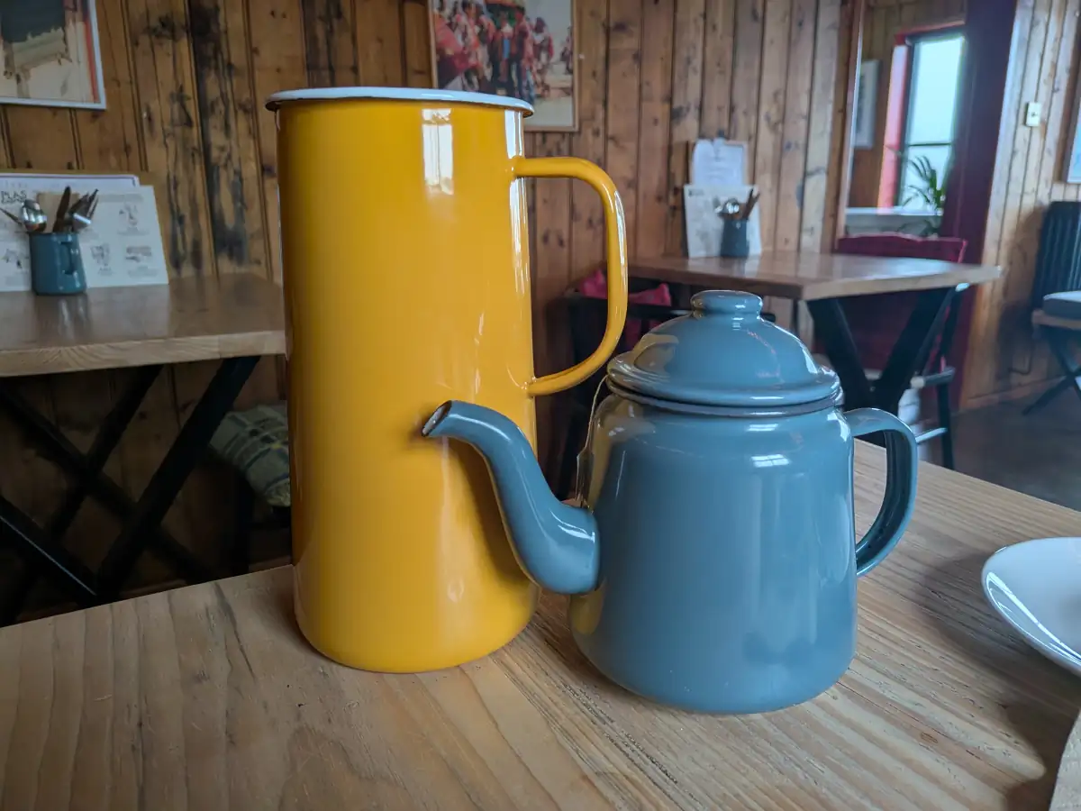
The mustard yellow and the steel blue are just beautiful; they work so well together, and I immediately decided I wanted to use this kind of palette for my next website design.
Since Monday I've been working on the re-design (something that's really simple to do with Pure Blog). it's now ready and I've launched the new site this evening. Here's what it looks like now:
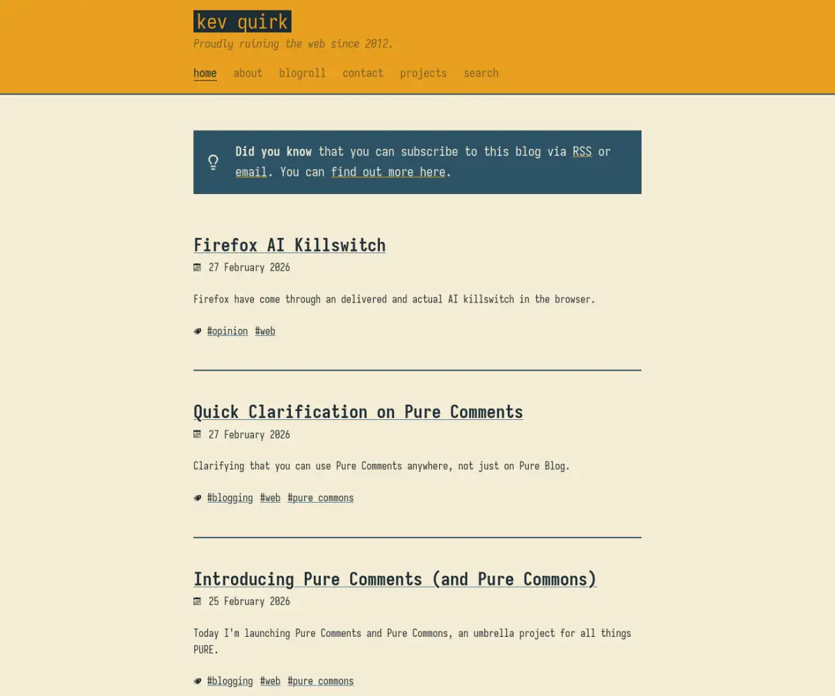 Light mode
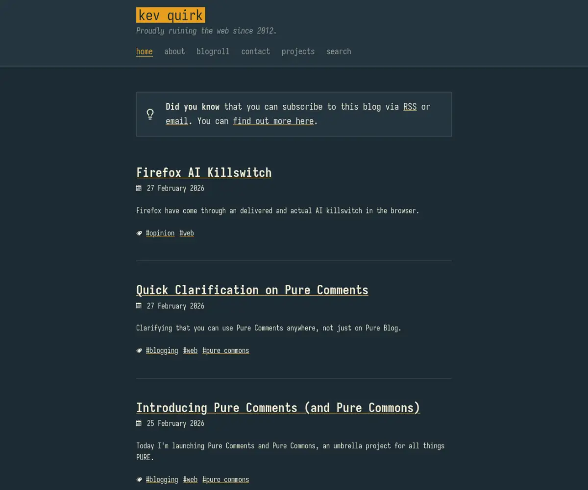 Dark mode
I thought about using the mustard colour for the entire background, but since this is a blog, reading experience is very important, and I felt I was straining my eyes when reading in full mustard mode. So I toned it down to this nice cream colour, and stuck with mustard for the header and footer only. While I was there I also got rid of the box-shadow effect to simplify the site header even more.
I have to say, I'm really happy with the result.
There's bound to be some little bug or caching issues here and there, which I'll mop up as I discover them. If you find an issue, please drop me an email or leave a comment, and I'll get it sorted.
Subscribe for more!
You don't have to keep coming back here to read my latest waffle. There's a couple of way to subscribe to receive updates whenever I publish new content.