A Reality Where CSS And JavaScript Doesn't Exist?
If you haven't done so already, I'd strongly recommend reading Bradley's post before continuing with this post. Go on, it's a great read (like most of his posts) So I'll wait...
Ok, read it? Good...So What Bradley is talking about is eradicating both CSS and JavaScript from the Internet. His rationale being that all of the web would be "consistent and boring" without them.
On this dystopian Internet, people would hunt for information and consume it on websites that all look exactly the same.
The web is just a system of HTML/plaintext documents sharing information and data. Users browse the web in quick bursts to satisfy their queries or read something interesting. Then, they return to real life.
-- Bradley Taunt
While this would equate to a much more private and efficient Internet, I'm not sure it would be better per se.
Design is beautiful
The Internet would be such a boring place without design. When I visit a new site, I'm often looking around at the design of the site, just as much as the content. I'm a sucker for nice design.
I love getting ideas for my own projects from folks who are far better designers (like Bradley) than I'll ever be. If we didn't have CSS or JavaScript, that would all be lost and the Internet would descend into a black and white, Times New Roman wasteland where people are unable to express themselves through their design.
Think of the reading experience
Bradley's site is one of my favourites to visit. Not just for his great content though; it's also because he's the only person I can think of who fiddles with his site more than me - every time I visit it, something is different. It's the website equivalent of Where's Wally.
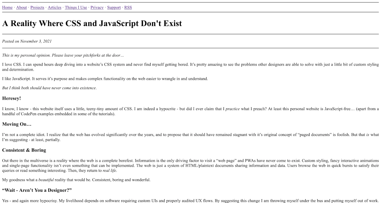
Currently his site is ultra minimalist, which I usually like. However, I think his current design is so minimalist that it affects the reading experience.

As you can see from the screenshot above, the text spans the entire width of the screen. I also think that the text is too small. Even on my little 13" MacBook Air screen, constantly scanning my eyes from the far left to far right of the screen really strains my eyes.
[I've written about website typography before](/whats-in-a-font-researching-website-typography/) and how the width of the content needs to be a certain width to prevent eye fatigue.
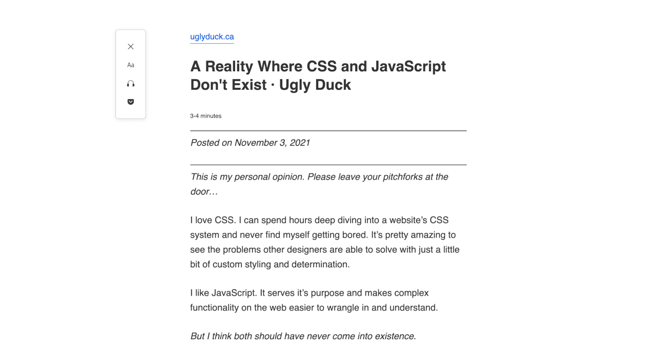
Lucky for me, Firefox's reader view comes to the rescue:

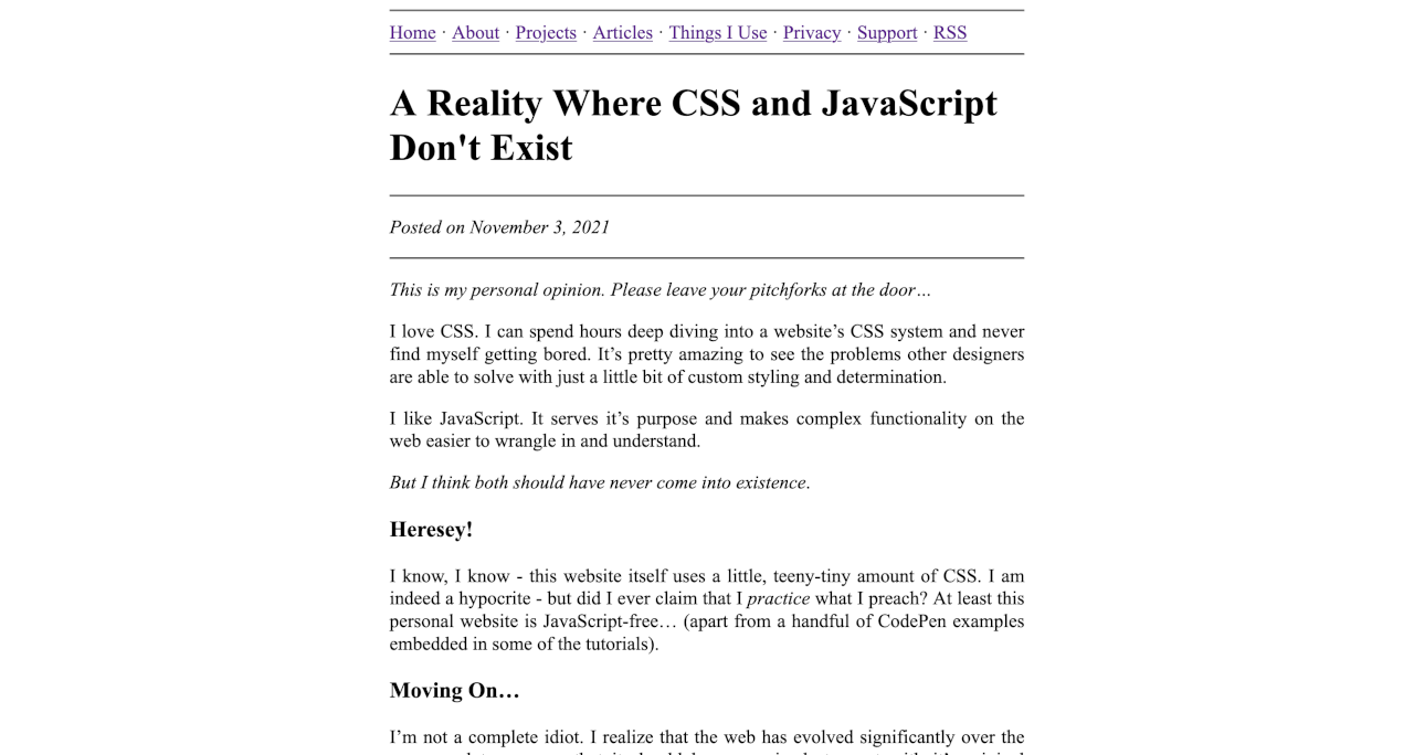
A similar look would be trivial to achieve with just a few lines of CSS, which would really improve the reading experience, I think.
body {
    margin: 0 auto;
    max-width: 40rem;
    font-size: 1.2rem;
}
Those few lines of CSS would add no discernible bloat to Bradley's site at all, but it does dramatically improve the reading experience for visitors like me.
This is why I think CSS should continue to exist.
Don't get me wrong here, Bradley has probably forgotten more about web design and CSS than I'll ever know. I'm not trying to berate him - like I said, I love his content and his site.
Bradley's current design is a great example of what his web utopia would look like, and I think it's just a step too far. It can easily be "fixed" but without CSS, how would we do that? Even if Bradley and others don't feel his website needs to be "fixed" at least there the option to make changes if he wishes.
Without CSS, that would be impossible.
Minimalism? Yeah, sure. Count me in! But this is Brutalism on steroids.
JavaScript isn't always bad
This site doesn't use any JavaScript, but that doesn't mean I'm against it. In fact, I've written about my thoughts on JavaScript before.
I won't re-hash those thoughts again here, but the TL;DR of the post is that I don't think JS is bad. I do, however, think its overuse and misuse (here's looking at you, GAFAM) is.
JavaScript does have its place on the web. It adds functionality that HTML and CSS simply can't. Cornerstones of modern society would be lost without JavaScript - eCommerce, Internet banking and smartphones would all be gone.
Now, you could probably argue that all of those things falling by the wayside wouldn't necessarily be a bad thing, and I'd tend to agree most of the time. However, like it or not, those kinds of services make our lives far easier than what they were before the Internet.
Final thoughts
A world void of any CSS or JavaScript is too far, in my opinion. However, a world that uses far less resource on the Internet - less CSS, less JavaScript, less fossil fuels...just less. Now that I can get onboard with, which is why I started the 512KB Club (which in turn is a shameless copy of Bradley's 1MB Club).
The 512KB Club also shows that you can achieve really beautiful websites with a small amount of resources; and in many cases, absolutely no JavaScript. This site, for example, is less than 150KB.
Bradley, I respect you as an incredibly talented designer. One that I will never be in the same league as. But I'm not sure I'm with you on this one, my friend. The Internet needs CSS and JavaScript. It just needs to use it a little more frugally.
What do you think? Should the Internet be void of all CSS and JavaScript? Please let me know your thoughts using the button below.
Update - 12th Nov 2021
I had an email from a reader, Karl, explaining that I had missed an important point in this post. Karl said:
Your point of not having good legibility is true, but only if the user did never learn how to resize windows, change default fonts or adapt his/her environment to his/her needs.
[...] I learned how to set up my browser so that it is providing me good legibility as *I* want to have it and not any arbitrary web designer with potential different points of view on color, contrast, sizes and so forth.
While I agree that this is important, and I probably should have mentioned it, I don't think that a website's design should depend on readers having to setup their environment in a way that suits them. If they have, great - they get an even better reading experience.
However, I think the default user experience of a website should be pleasant and accessible, even if they haven't taken steps like Karl has. Actually, I'd be willing to bet that the vast majority of Internet users wouldn't know how to setup their browser like Karl.
What do you think?