A New Lick of Paint
| 2 min read
After updating the design history page recently, I got all nostalgic for the 2020 version of this website. I loved the design of it and the way in which it used emojis as icons. It was just a really fun design.
After playing around with different designs for the new version of the site, and even emulating the old site almost perfectly, I came to the realisation that I actually prefer the sidebar layout I already have.
So instead of trying to emulate that 2020 version, I decided an iterative update of the existing design was in order.
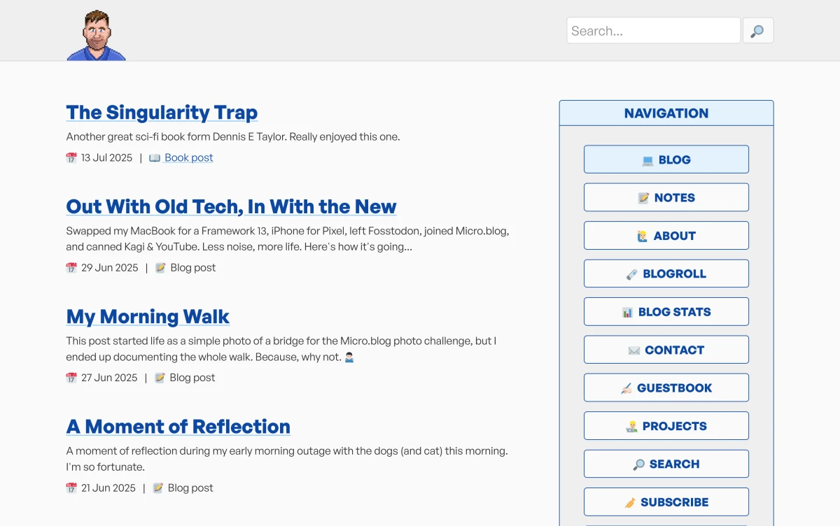
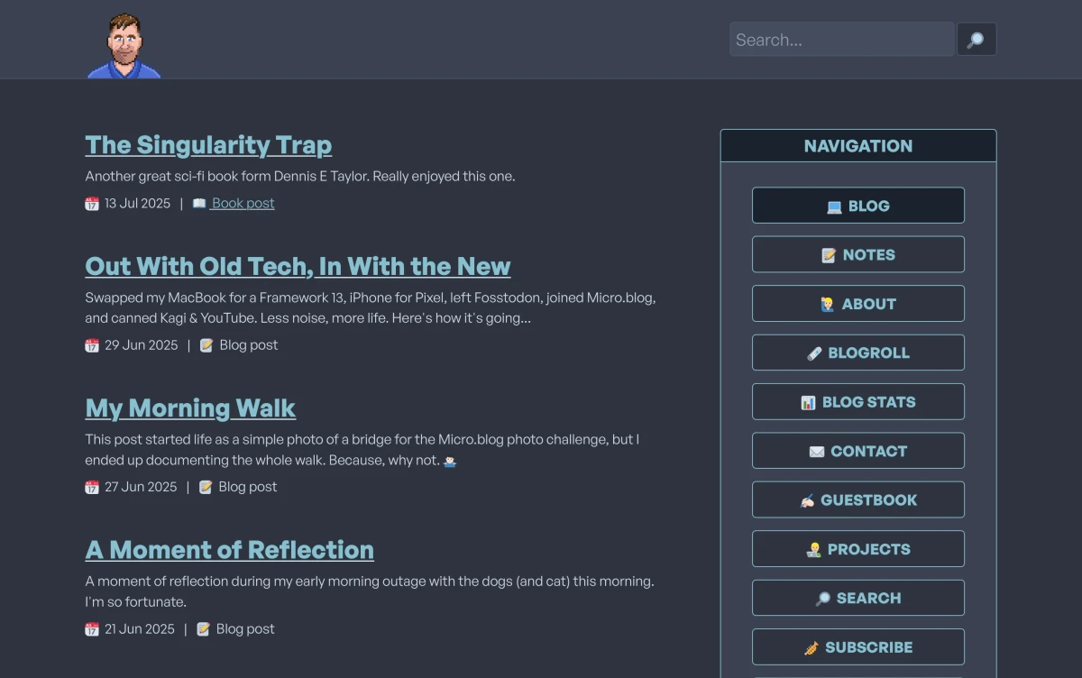
This new version is still using a sidebar (albeit a little wider now), it still has a brutal aesthetic, and it's still content focussed. But there's a few things I've changed, some of which are more obvious than others. Here's a list of some of the changes I've made:
- A new colour pallet that's similar to the 2020 design.
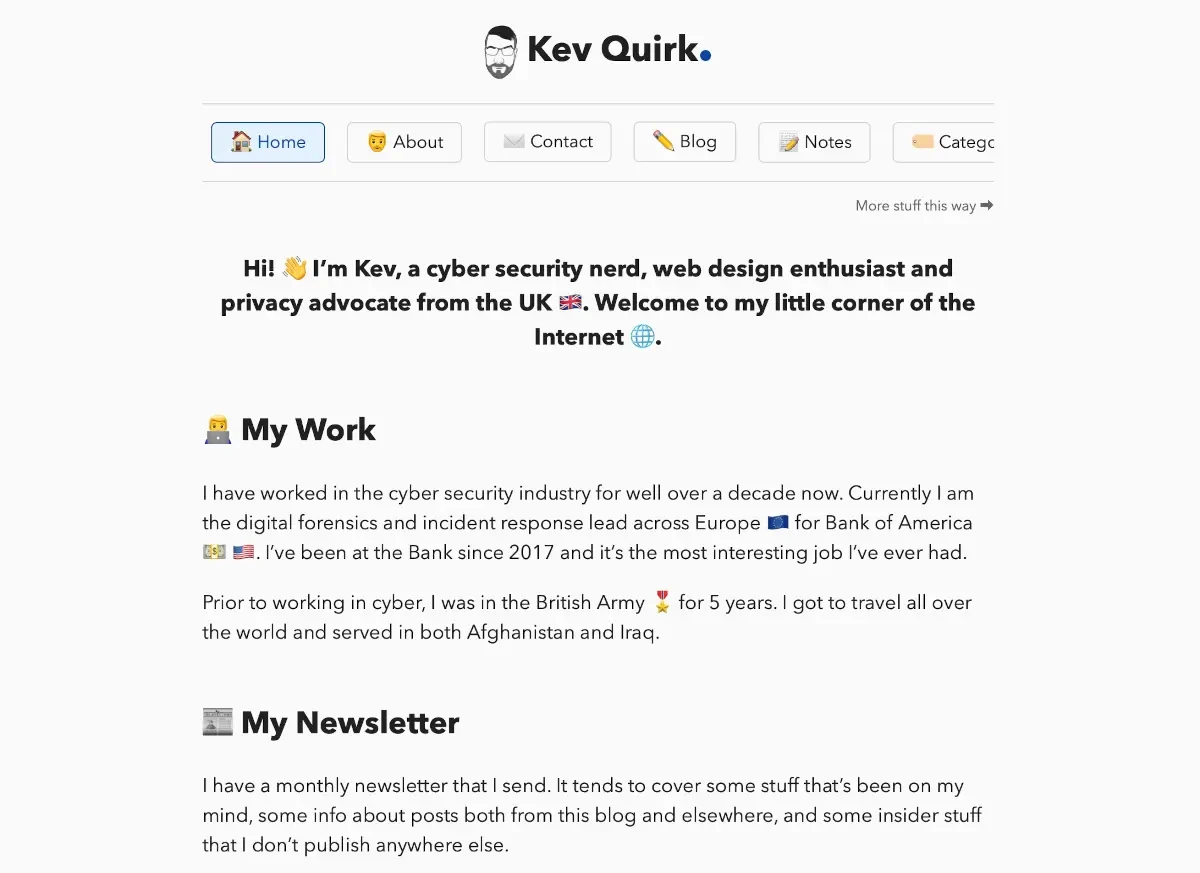
- A brand new header that includes the avatar Joel made for me (hover over it for a fun Easter egg) and a search bar.
- Emojis everywhere that are using Twemoji, so they should look the same no matter which OS you're using. I've also replaced a lot of the iconography with emojis - I think it's more fun!
- Removed around 400 lines of CSS from my stylesheet.
There's lots of other little improvements too, and some that I still need to make, but for now I'm happy with the new design.
What do you think?
Subscribe for more!
You don't have to keep coming back here to read my latest waffle. There's a couple of way to subscribe to receive updates whenever I publish new content.