New Design for Sept 2026
| 1 min read
I decided I was bored with the previous design, but wanted something that was in keeping with the previous design (brutalist and using a monospace font) yet different.
I abandoned the yellow accent and went back to blue, my favourite colour. I also changed the font to Victor Mono.
I like how the new design draws from different versions of the site's history - lots of neo-brutalist design, clean colours and font, plus a bit of whimsy. If you're reading this via RSS, here's what the new design of the site looks like (although I'd recommend you head to the site and experience it properly):
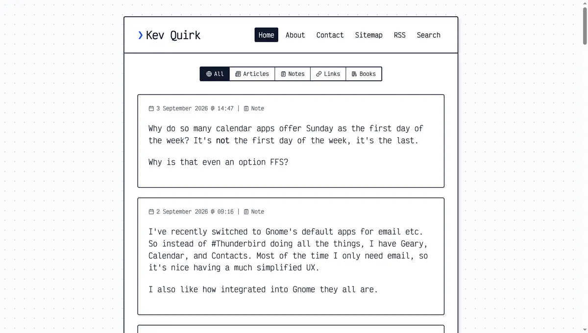
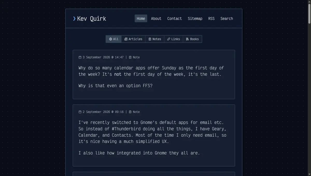
I love how Pure Blog makes it so easy to change things like this. All I really did was pick a new colour palette, then add some custom CSS. The rest is all default Pure Blog, pretty much.
Hope you like the new lick of paint!
Subscribe for more!
You don't have to keep coming back here to read my latest waffle. There's a couple of ways to subscribe to receive updates whenever I publish new content.